


What is a responsive web design and should you incorporate this concept into your business’s website? Responsive web design, one of this year’s biggest new trends in the industry, refers to a site that aims to provide an optimal viewing experience regardless of the device the viewer is using to access the site.
For example, a site using responsive design will adapt to the size of a smartphone, tablet, laptop, or desktop computer so that minimal scrolling is necessary for the viewer. Read on to learn more about the pros and cons of this design approach.
What Is Responsive Web Design?
Responsive web design allows you to create just one site for your business that will adapt to its surroundings, as opposed to a separate mobile site that is optimized for tablets and smartphones.
The pros of this approach are that you only have to update one website, and since there’s a single URL, it’s easy for readers to find you regardless of the device you’re using. This approach typically costs less than developing separate websites, requires less content, and allows you to keep the same SEO data across platforms.
While responsive design is a great option for many types of sites, it may not be the best choice if you find that one side is not adequate to meet users’ needs on both desktop and mobile platforms.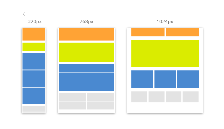
Trying to optimize one site for mobile and desktop users may diminish the user experience and readability for both groups. Another option is to create a separate mobile website that adapts the content from your main site to optimize it for users viewing on a tablet, smartphone, or another device.
This approach allows you to make the most of the features that stand out on a smartphone; however, since there is a wide variance in screen sizes and other specifications, even a separate mobile website must have responsive features to account for these differences. Mobile websites provide optimal user experience and speed and are a good value although more expensive than a responsive site.
However, you do need to maintain two separate websites, which may be daunting for some business owners. The third option to ensure that customers on all devices are able to view your site is a native app: a separate program that can be downloaded directly to smartphones and tablets.
This approach is favoured by web design agencies and typically costs less than developing separate websites, requires less content, and allows you to keep the same SEO data across platforms.
Native apps provide the best user experience, accessibility, and speed, and can incorporate special features that may not be available on a responsive website. They are a great option for business owners who want to get creative with content. However, native apps can be very costly to build, are not flexible, and may not be available to all users. For example, an iOS app will not be available to those with Android devices.
A web programmer can work with you to help determine which of these three options is best for your business. Since an estimated 28 per cent of website traffic comes from mobile devices, it’s critical that you offer an optimized experience for these users, regardless of whether you opt for a responsive site, a separate mobile site, or a native app.