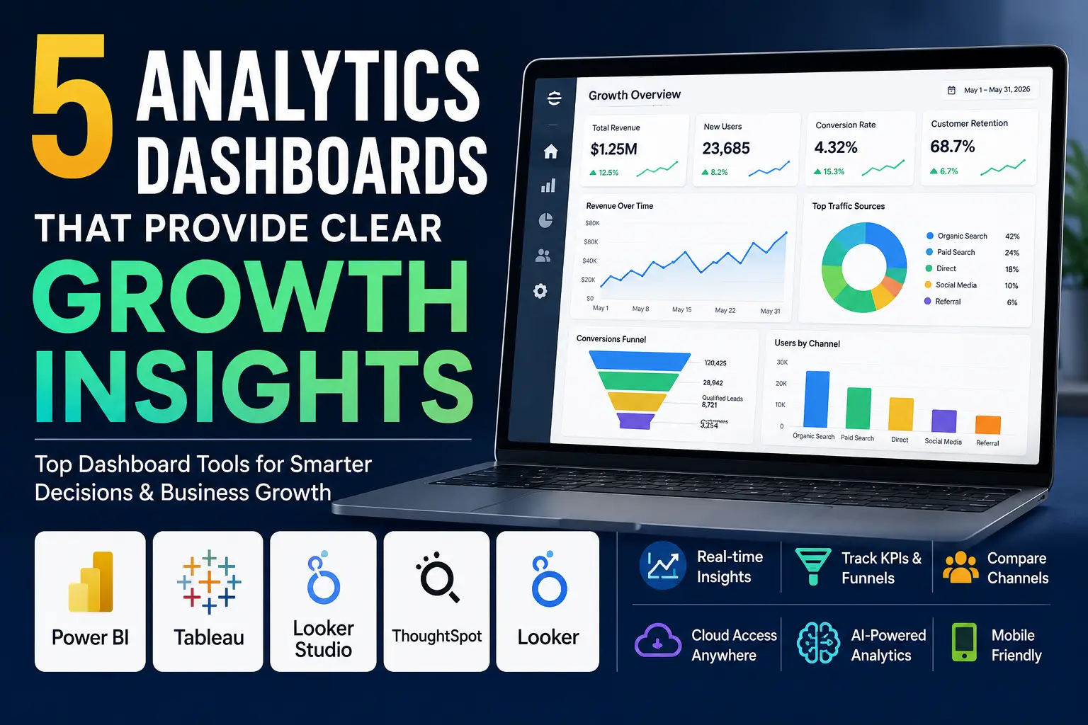
Rather than trying to get even more numbers, your team needs to be using analytics dashboards that provide insight to help your growth team make faster and more effective business decisions. The best analytics dashboards allow you to see trends easily, how one thing has impacted your teams overall performance and allow your team members to take actionable steps across your entire organization (i.e., marketing, sales, product development, operations, etc.)
Why are Dashboards Important?
A good analytics dashboard will do much more than show you some charts; it will help you monitor key performance indicators (KPIs), identify trending anomalies, make comparisons between channels, and identify which item has contributed to a downward trend in revenue or retention.
Analytics dashboards created on modern platforms by 2026 will also utilize artificial intelligence, be updated in near-real-time, provide cloud-based access, and be mobile-friendly, giving team leaders fast access to important data without having to sort through spreadsheets to find answers to their questions.
What To Look For
Before selecting a dashboarding tool, consider the following features:
- Real-time or near-real-time data updates
- Easy-to-read and accurate visualizations for trends, funnels, and comparisons
- Ability to share your dashboarding information easily with team members and stakeholders
- Ability to apply flexible filters and perform drilldowns
- Ability to integrate with all of your current data sources
5 Dashboarding Tools Available
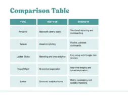
1.Power BI
Microsoft’s Power BI is a great reporting tool for teams who require detailed reporting in the Microsoft ecosystem. It is a great choice for finance, sales and operations dashboards because of its strong abilities for structured reporting and simple creation of dashboards from existing reports.
Power BI should be used when you need to create governed reports with repeatable metrics while offering a familiar enterprise environment for your team. Power BI combines robust depth with successful ease of use for teams.
2. Tableau
Tableau is best used for creating high quality presentations with significant flexibility in the style of the presentation. It is widely regarded as one of the best products to create a polished dashboard from complex data; making it easier for your organization to view and understand trends.
Tableau should be used for Executive reporting, Leadership dashboards, Visual storytelling or for making it easy for your audience to comprehend the story behind the data.
3. Looker Studio
Looker Studio is a wonderful option for Marketing and Web Analytics teams who are already leveraging Google data sources; it connects very well to GA4, Google Sheets and other common data sources for reporting.
When you want to create a fast, easy to share and easy to build and update dashboard, Looker Studio should be the tool of choice. Looker Studio is also ideal for Growth teams who need real-time visibility into Traffic, Conversion Rates and Campaign Performance.
4. ThoughtSpot
ThoughtSpot provides business analytics dashboards, with AI-driven exploration, to teams who prefer real-time insights and would like to discover patterns without extensive technical expertise. As a result, ThoughtSpot makes it simple for teams to ask questions, and uncover insights about their data without needing to have an extensive technical background.
Use ThoughtSpot when your stakeholders want more than just static reports. It will work well for you if your organization prefers fast data exploration, and prefers getting answers to their business questions, directly off of live data.
5. Looker
Looker works best when used by engineering teams who are leading their organizations to establish a set of governed metrics across all departments. It is an excellent tool for organizations that place equal importance on data modeling/consistency and visualization/insight generation.
What to Consider When Choosing
Choose the dashboard solution to meet the needs of your team workflow but do not choose it based solely on its charts being flashy.
Organizations that rely heavily on Google Analytics, Google Sheets, and other Google data sources will often find Looker Studio to be the quickest and most practical reporting solution. For businesses that require enterprise-grade reporting, strict governance, and standardized metrics across departments, Power BI or Looker are generally stronger choices.
Teams that prioritize visual appeal and presentation quality may find Tableau to be the most suitable platform. Meanwhile, organizations seeking AI-powered data exploration and faster insight discovery can benefit significantly from ThoughtSpot’s natural search and analytics capabilities.
Use Looker to provide your organization with a true single source of truth relative to your metrics and to provide your organization with dashboards which will allow your team members to see their metrics consistently, regardless of their department. This is particularly useful in organizations that have established more mature analytics processes.
FAQ
1. Which dashboard is best for marketing growth insights?
Looker Studio is a strong option for marketing teams because it connects easily to GA4 and other Google sources.
2. Which dashboard is best for enterprise reporting?
Power BI and Looker are both strong options for governed, scalable reporting.
3. Which dashboard is best for visual presentation?
Tableau is a top choice when the dashboard needs to look polished and easy to interpret.
Leave a Reply